Custom
Letterforms
TYPOGRAPHY, ANIMATION, POSTER DESIGN
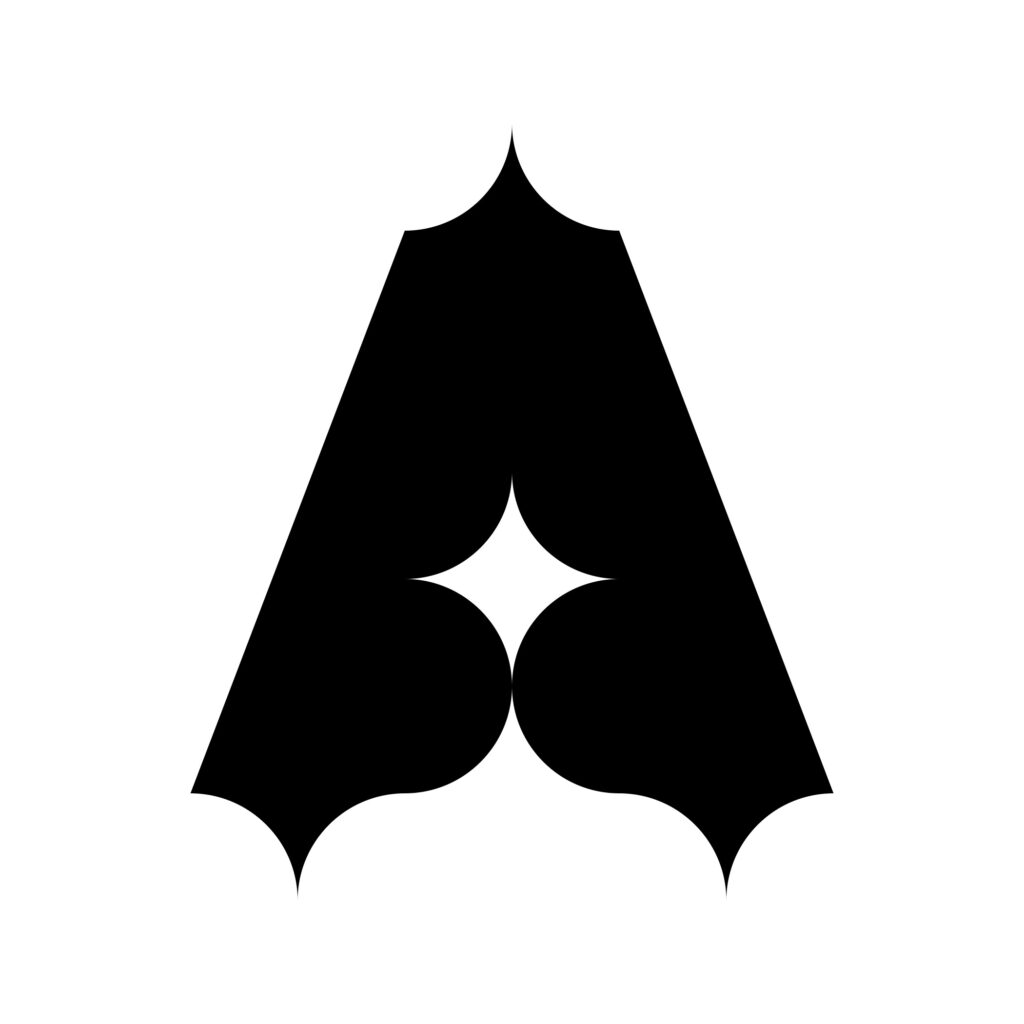
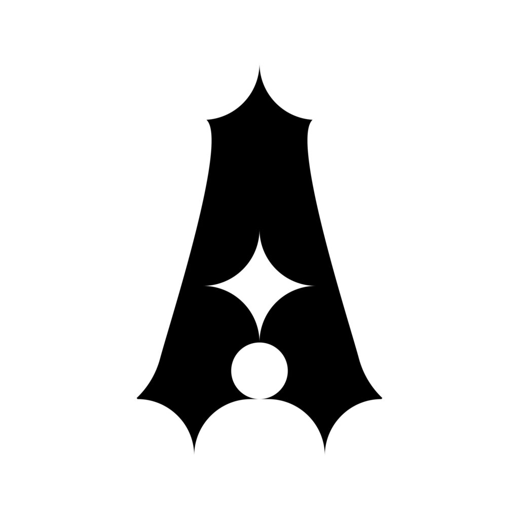
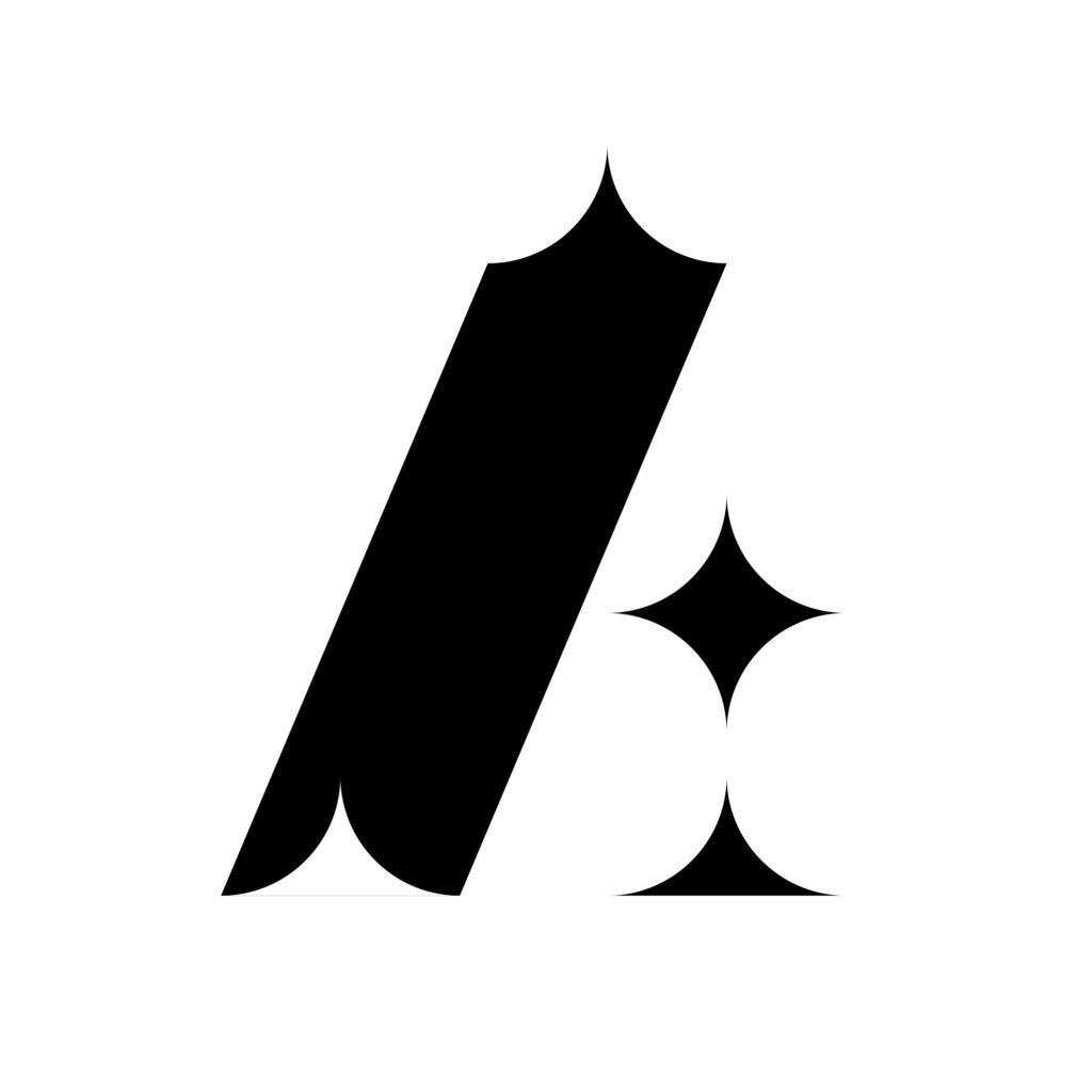
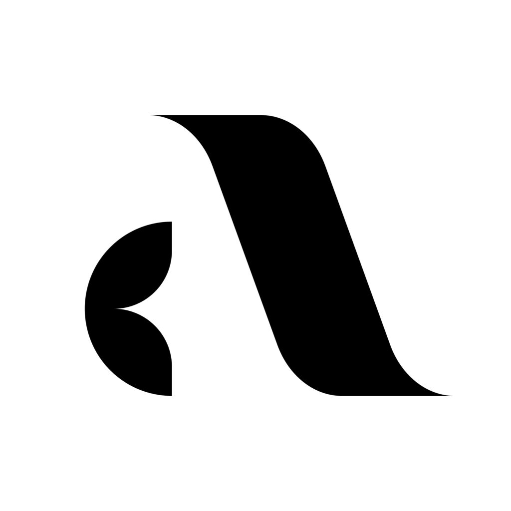
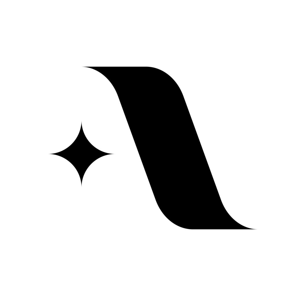
Custom letterforms and type exploration of the letter A.
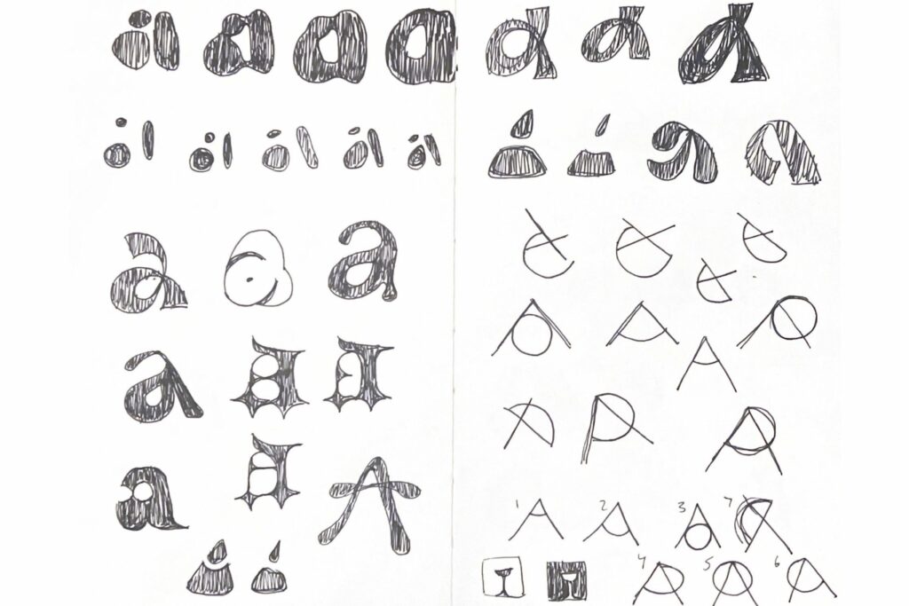
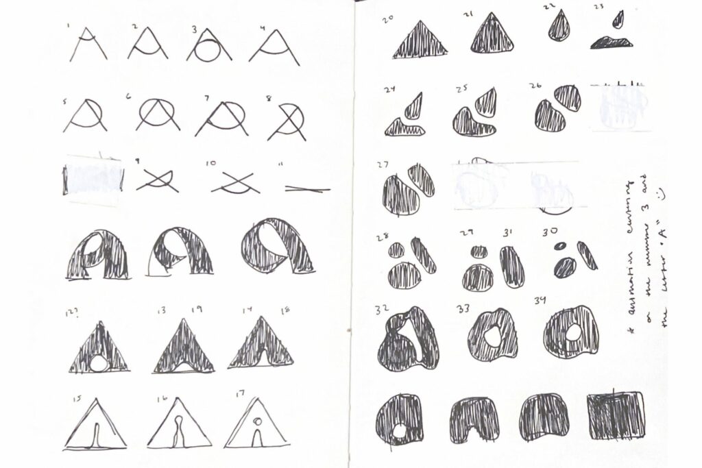
The animation features five groupings of letterforms that utilize similar basic shapes. Additional iterations of decorative type were inspired by the contours and counterparts of a circle.
These posters use type and image to contrast a sharp, uppercase letter with its bulbous, lowercase counterpart. Body movements are inspired by the range of weights and widths of a letterform combined with relevant imagery.
As a shape exploration, I created a black and white animation of the upper and lowercase letter A. Each series of letters features a unique visual system.
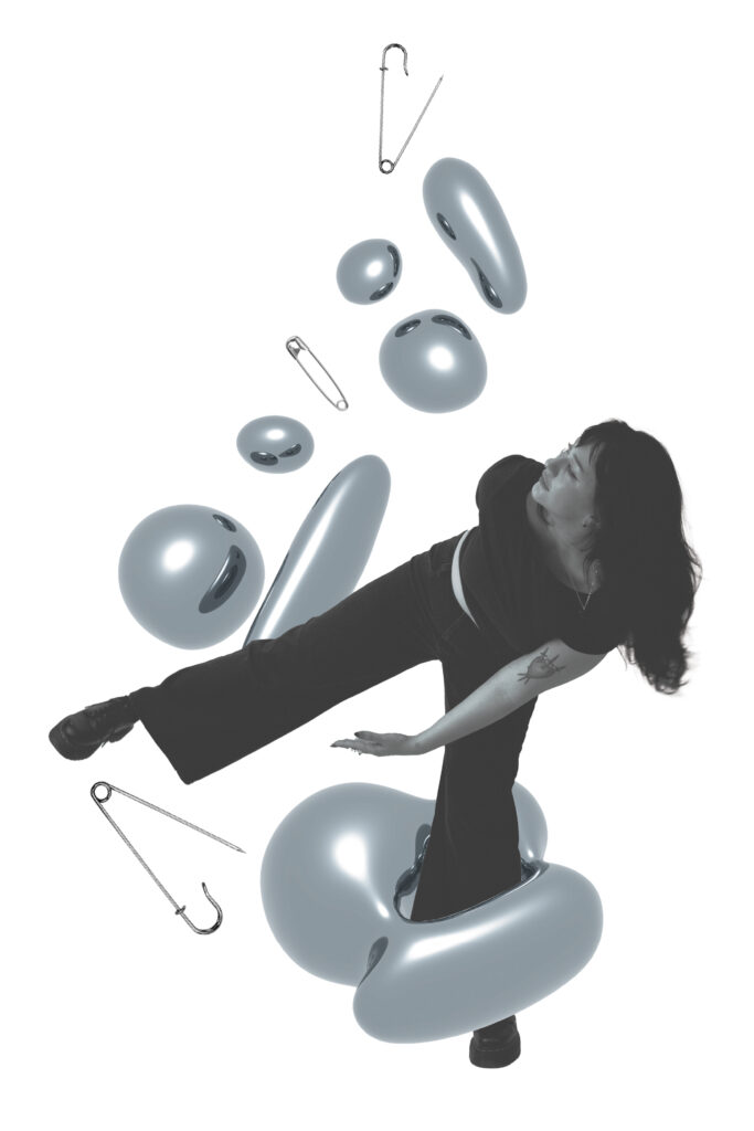
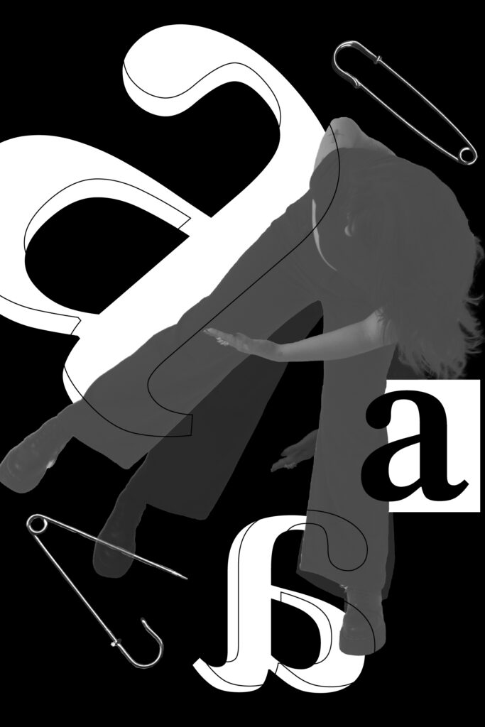
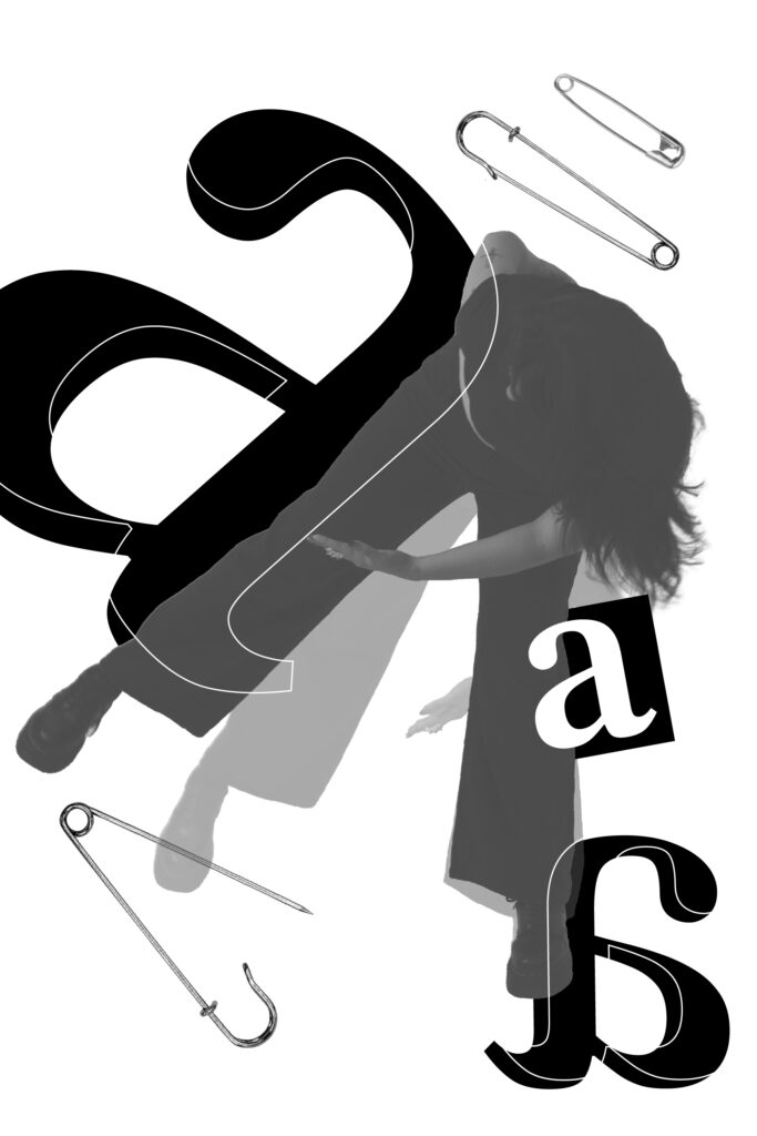
These posters contrast type and imagery in order to illustrate qualities of the letter A. Specifically, the variations of weight and width are shown through stretching body movements and safety pins.